Branding a cross-regional investment firm

Hakono was a newly formed investment consultancy operating across Asia and the West. The team needed a brand that could speak confidently to both markets - something that felt established but not dated, modern without appearing untested. My job was to create an identity system that balanced those tensions while giving the business the tools to communicate clearly from day one.
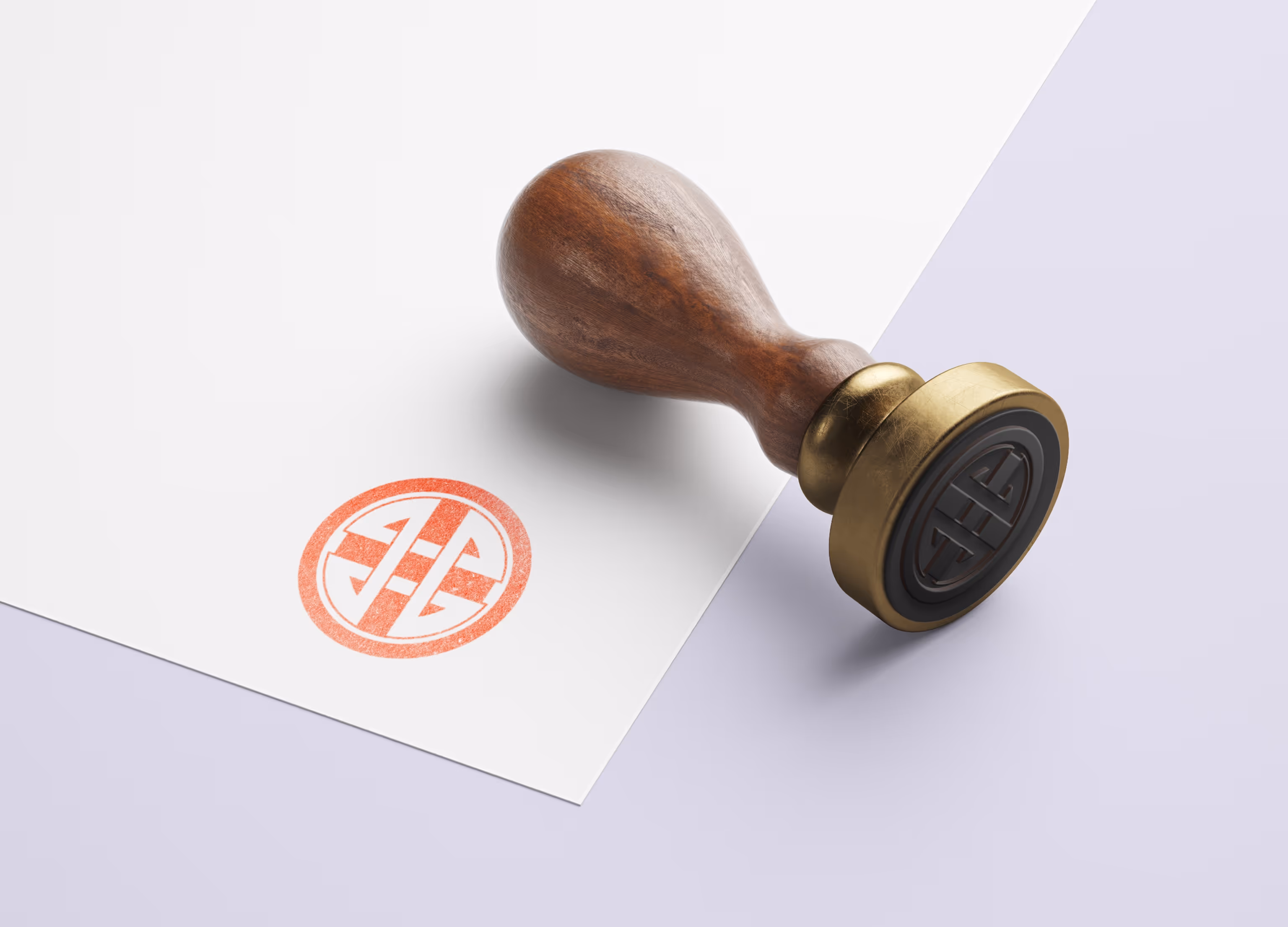
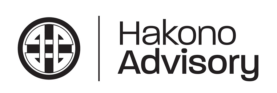
The project covered logo design, type selection, brand guidelines, presentation templates, a website, and even a physical stamp. I worked closely with the founder to build a look and feel that reflected the consultancy’s cross-cultural positioning. The logomark took cues from traditional Asian forms but was stripped back to feel clean and sharp. The typography and layout system leaned toward Western minimalism, helping the brand land with international clients.

Working in close step with the founder, I delivered the full identity system in a tight timeframe. The speed of execution meant Hakono was able to launch with a strong visual foundation and no compromise on quality. With everything in place, from guidelines to client decks to a functioning site, the business could start conversations immediately - backed by a brand that felt sharp, composed, and ready.

All imagery and trademarks belong to their respective owners and are shown for reference only.